You are using an out of date browser. It may not display this or other websites correctly.
You should upgrade or use an alternative browser.
You should upgrade or use an alternative browser.
Important Market data charts on home page
- Thread starter pmbug
- Start date
Thread contains important information that may impact how you use the forum
Welcome to the Precious Metals Bug Forums
Welcome to the PMBug forums - a watering hole for folks interested in gold, silver, precious metals, sound money, investing, market and economic news, central bank monetary policies, politics and more.
Why not register an account and join the discussions? When you register an account and log in, you may enjoy additional benefits including no Google ads, market data/charts, access to trade/barter with the community and much more. Registering an account is free - you have nothing to lose!
You are correct in that assessment.I think on smaller screens, the finviz charts may be hard to read.
Edited to add: you can see which way things are moving, but the numbers are hard to see.
...but even the kitco ticker you had was small and had to be zoomed in on to be able to read it. I think pretty much any of 'em are gonna look tiny on small screens.
Last edited:
I made another adjustment (showing a 2 rows of 2 charts instead of 1 row of 4). I think they are bit easier to read now, but they take up a lot of top of the fold real estate now.
Should I ditch them and put the kitco charts back?
Should I ditch them and put the kitco charts back?
I like the charts. I'm not a big fan of Kitco anyway.
Imho, make some changes and wait for more feedback on it. Personally, as long as there is a way to see it, it's alright.Should I ditch them and put the kitco charts back?
On our old site, none of the tickers ever showed up on my small screen anyways. I would have to set it to display desktop version if I wanted to see it.
BTW, I could add any number of finviz charts there - WTI/Brent crude, DJIA, Nasdaq 100/Russell 2000, VIX, Platinum/Palladium, 30/10/5/2 Yr treasury bonds, etc. Anything in particular be of interest to you folk?
TRYNEIN
Predaceous Stink Bug
I like them being available on the home page,
but glad they are not on every page...
But I'm only 1 vote on that and it doesn't really count anyways...lol
but glad they are not on every page...
But I'm only 1 vote on that and it doesn't really count anyways...lol
This is a responsive template so the side bars appear below the main content when viewed on a phone. On my phone, the side charts look even better than on the computer. Bigger and easier to read. You do have to scroll down a bit to see them though.... Don't know about a phone type device. ...
spinalcracker
Ground Beetle
- Messages
- 568
- Reaction score
- 1,010
- Points
- 278
can we get a BitCoin Chart on the front page with the other charts?
can we get a BitCoin Chart on the front page with the other charts?
It already exists in the widget block with an Ethereum chart. If you are on desktop, you will see it on the right hand side. If you are on mobile, it's at the bottom of the page.
I had experimented with replacing the kitco charts with the Finviz charts a while back, but the Finviz charts are a larger size and did not fit well in a horizontal widget.
I'm open to suggestions/ideas on the layout though.
spinalcracker
Ground Beetle
- Messages
- 568
- Reaction score
- 1,010
- Points
- 278
It already exists in the widget block with an Ethereum chart. If you are on desktop, you will see it on the right hand side. If you are on mobile, it's at the bottom of the page.
I had experimented with replacing the kitco charts with the Finviz charts a while back, but the Finviz charts are a larger size and did not fit well in a horizontal widget.
I'm open to suggestions/ideas on the layout though.
thanks Mang!
I had not scrolled down the page in forever but now I see it..
thanks for the heads up!
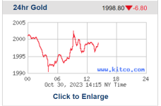
I replaced the kitco charts at the top of the page for the moment. We lose market data on platinum and palladium with this layout, but the Finviz charts are more reliable and informative than the kitco charts. What do you all think? Better or worse than what we had with the kitco charts?
It's a constant battle to find a chart that works well. Kitco charts frequently "freeze" and don't t update for hours. The Finviz charts we are using now seems to update with every screen refresh, but they lag real time by 15 minutes.
netdania.com charts are interactive javascript that won't work for embedding in pmbug.com pages like the Kitco and Finviz charts.
When I visit the Finviz gold chart on the finviz site:
 finviz.com
I see that they are actually quoting the price for a "100 ounce gold contract" (I assume the COMEX's GC contract?) whereas netdania is charting the XAUGLD. Looks like they are not the same thing.
Marketwatch lists a GC00 "Gold Continuous Contract" that appears to match the Finviz chart:

 www.marketwatch.com
So what does it mean when XAU has a wide divergence from the GC00?
netdania.com charts are interactive javascript that won't work for embedding in pmbug.com pages like the Kitco and Finviz charts.
When I visit the Finviz gold chart on the finviz site:
Futures Gold Chart Daily
Stock screener for investors and traders, financial visualizations.
I see that they are actually quoting the price for a "100 ounce gold contract" (I assume the COMEX's GC contract?) whereas netdania is charting the XAUGLD. Looks like they are not the same thing.
Traders often talk about the XAU, but what does it stand for? It's the ticker symbol for the Philadelphia Stock Exchange Gold and Silver index, which tracks the performance of a basket of gold and silver mining stocks.
...
The XAU is not computed as a simple average of a group of stock prices. Instead, like the S&P 500 and many other indices, the XAU is a capitalization-weighted index, which means that the larger companies in the index account for a greater percentage of the index's value.
...
Marketwatch lists a GC00 "Gold Continuous Contract" that appears to match the Finviz chart:

GC00 | Gold Continuous Contract Overview | MarketWatch
GC00 | A complete Gold Continuous Contract futures overview by MarketWatch. View the futures and commodity market news, futures pricing and futures trading.
So what does it mean when XAU has a wide divergence from the GC00?
I spent some time this morning reconfiguring the Market Data widgets (both top and side/bottom). If you visit your Preferences page:
You will now see a new configuration option called Market Data (just above the Push notifications setting) that has 3 radio button options:
Finviz charts
Kitco charts
Goldseek charts
You can select one of the three and that will determine which charts you see on the home page (and forum node/list page). You can go to your preferences page and change that setting at any time if you want to compare the different charts/layouts/etc.
I'm open to ideas/suggestions if there is something you would like to see different or new from what I've done so far.
I like it much better on both a personal device and full size screenOK. Is that better?
Finviz tracks Comex contracts which fairly closely track spot futures, but sometimes vary noticeably. Goldseek and Kitco track the spot futures, but are different asthetically and may have different uptime (refresh with fresh data may vary)....What's the difference between the 3 charts? Anything notable?
Ever since selecting a market data option, the site lags significantly for me. weblinks247.com seems to be the culprit.
Is there a way to not have any market data?
Is there a way to not have any market data?
You have kitco charts selected as your preference right now. Kitco recently had their website hacked and was offline for a week or two. I'll have to see if they changed the location of the charts that we were using. In the meantime, I recommend setting your market data preference to Goldseek.
I found a workaround, so all's well.
I checked kitco this morning and I don't see where they are still publishing the metals charts like they used to. They are using some tradingview charts on their own site now.
I've replaced the Kitco charts with Goldseek charts on the Kitco option for now. Maybe kitco is still fixing their site and they will publish the charts again. If so, I'll fix it when I can.
I've replaced the Kitco charts with Goldseek charts on the Kitco option for now. Maybe kitco is still fixing their site and they will publish the charts again. If so, I'll fix it when I can.
Kitco fixed their chart publishing some time ago. This morning, I updated the Kitco chart option here to show the Kitco charts again.
I also found a 24 hour Gold-Silver ratio chart from Goldseek, so if you set your chart preference to Goldseek, you will see that chart in the display now. The Goldseek charts are now 5 across and a bit crowded, so if they are now too small, I can remove one of the charts to restore the original display size. Let me know what you all prefer.
I also found a 24 hour Gold-Silver ratio chart from Goldseek, so if you set your chart preference to Goldseek, you will see that chart in the display now. The Goldseek charts are now 5 across and a bit crowded, so if they are now too small, I can remove one of the charts to restore the original display size. Let me know what you all prefer.
* bump *
Finviz hourly charts are not working right now. It's an issue on their end. The hourly charts aren't working on the finviz.com website either:
 finviz.com
The daily charts are still working, so maybe it's just a temporary glitch. If the hourly charts don't start working again in a day or so, I'll replace the hourly charts with the daily charts.
Finviz hourly charts are not working right now. It's an issue on their end. The hourly charts aren't working on the finviz.com website either:
Futures Metals Charts Hourly
Stock screener for investors and traders, financial visualizations.
The daily charts are still working, so maybe it's just a temporary glitch. If the hourly charts don't start working again in a day or so, I'll replace the hourly charts with the daily charts.


